Visualization · from the thesis
Data Renderings
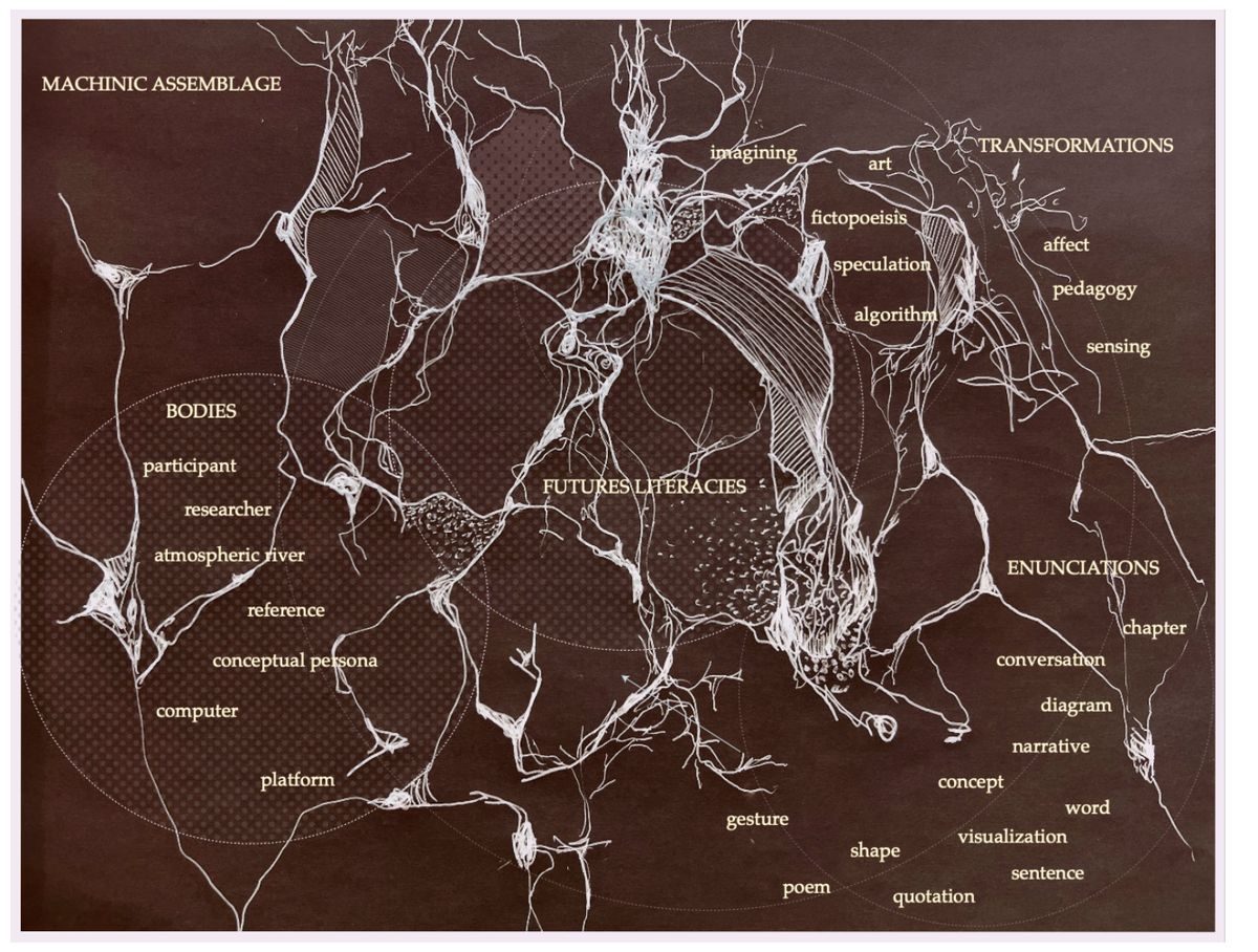
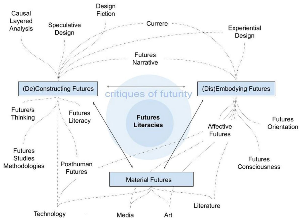
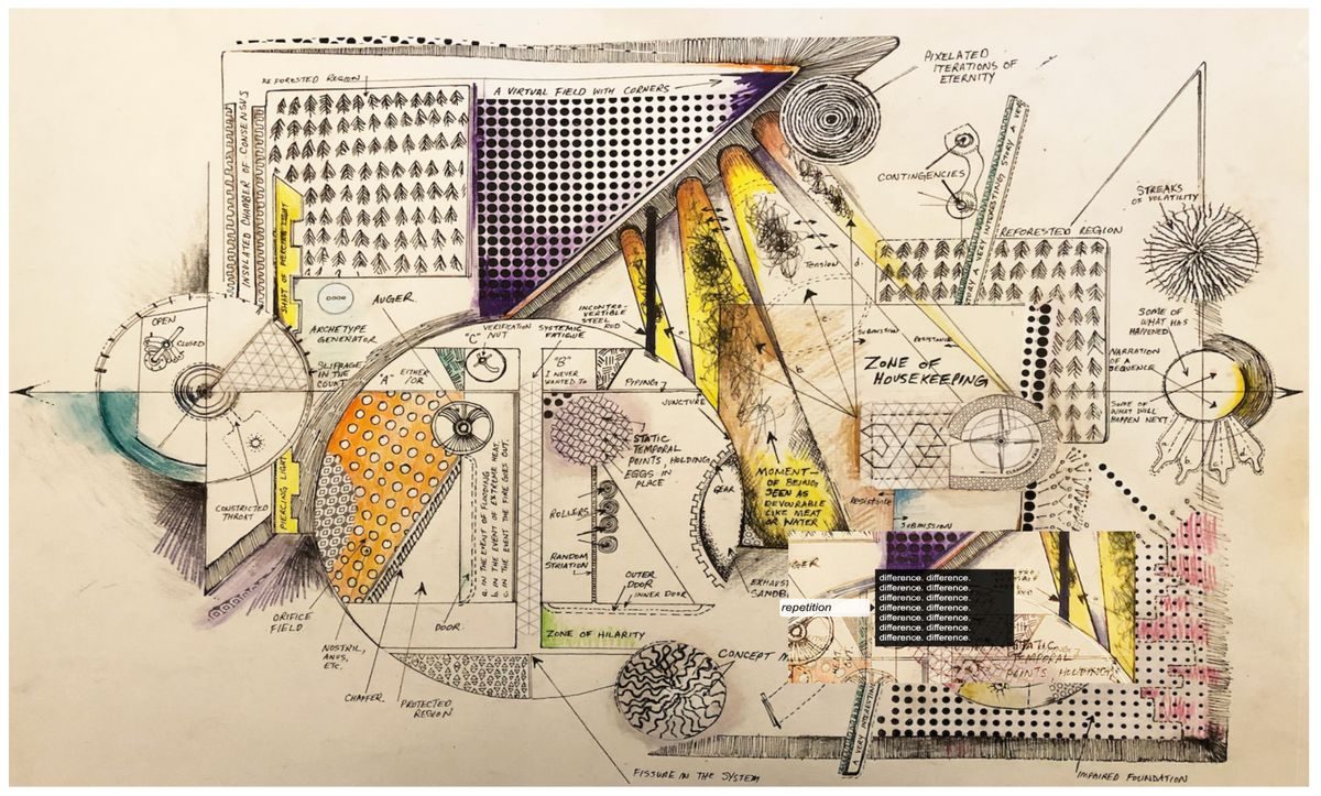
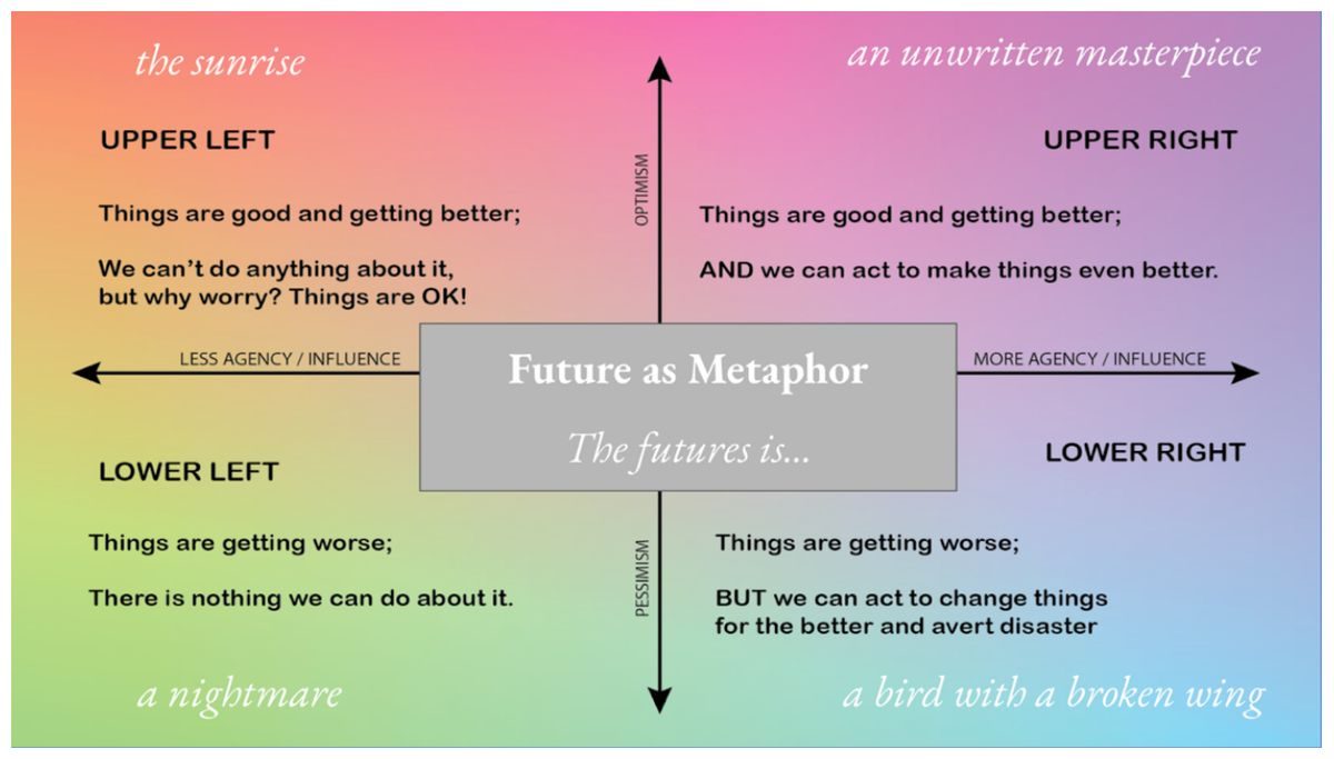
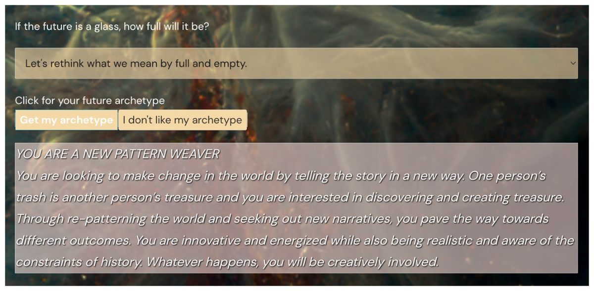
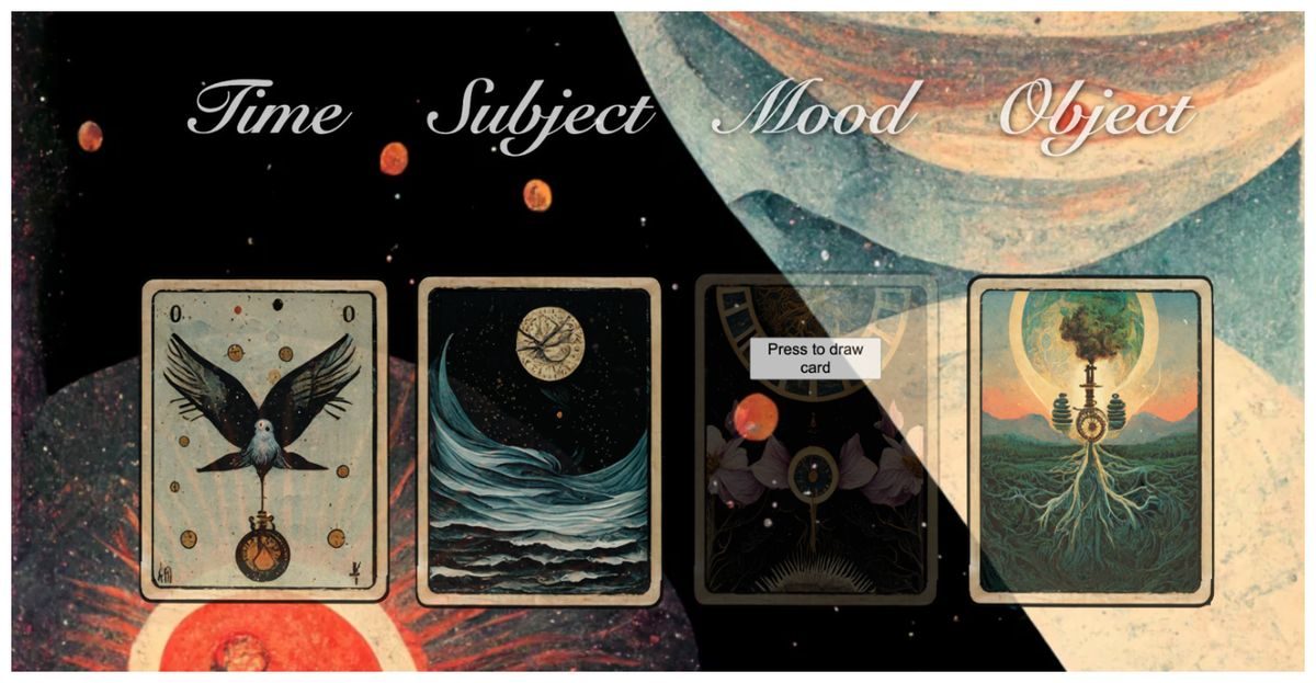
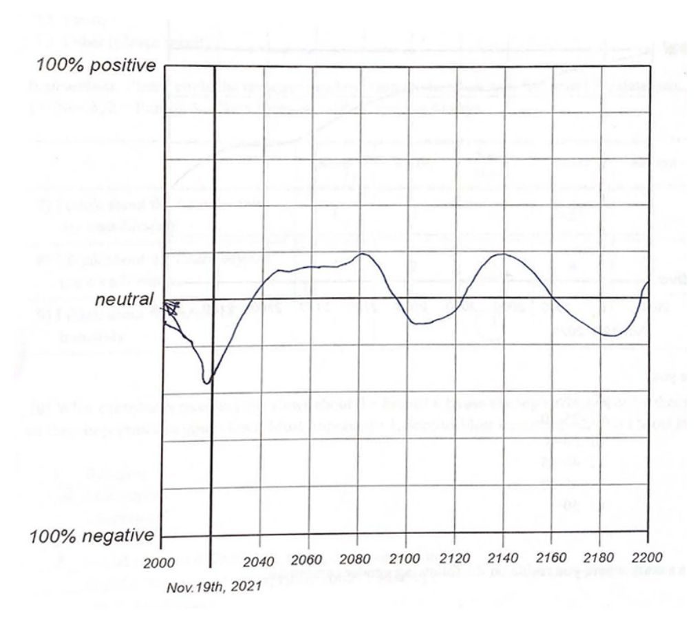
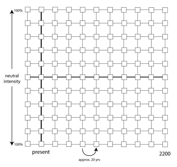
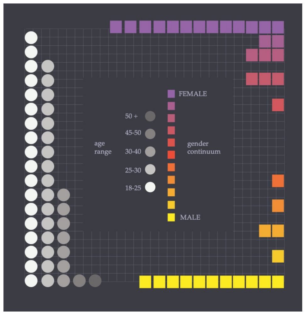
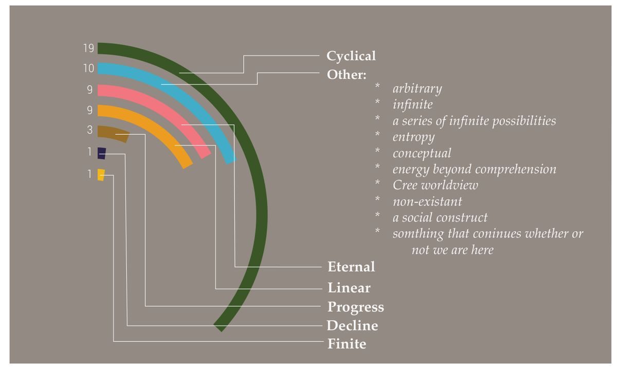
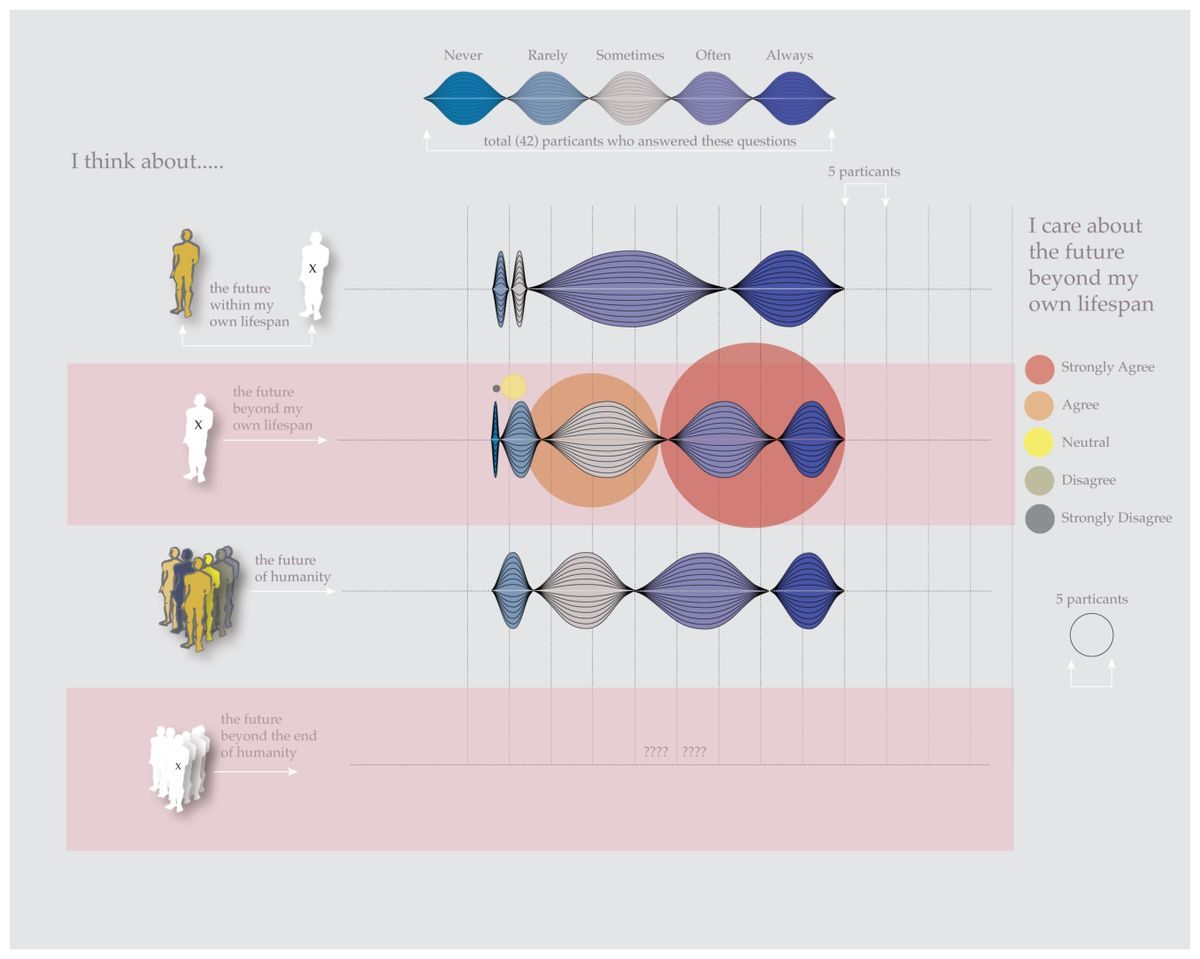
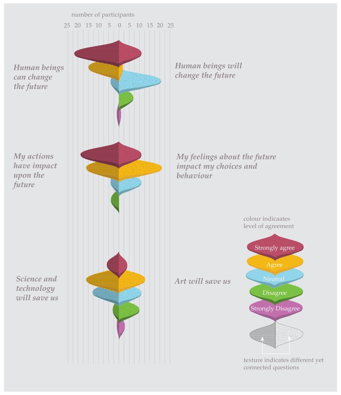
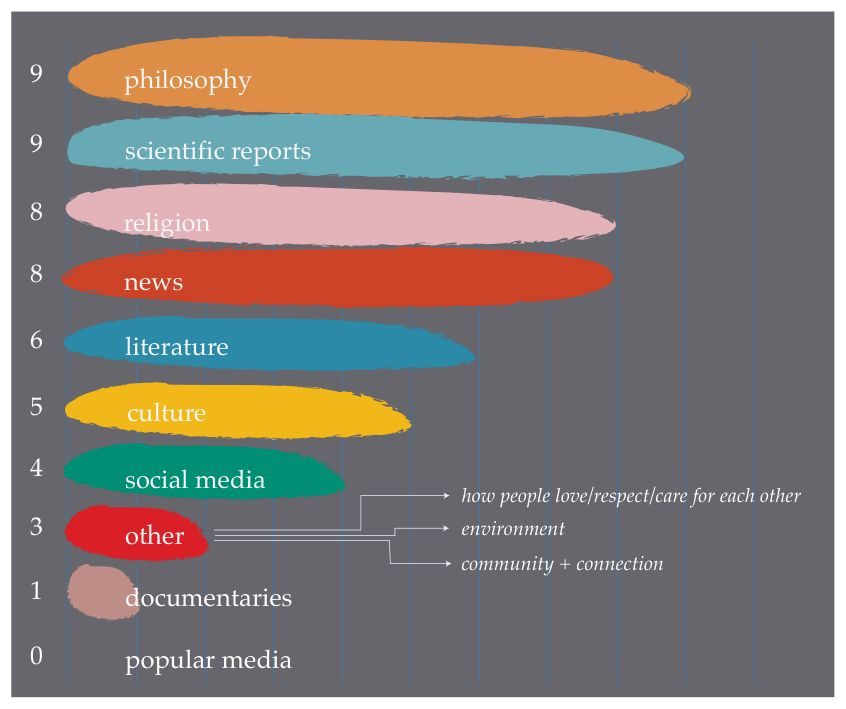
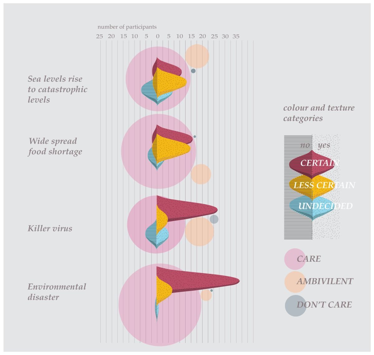
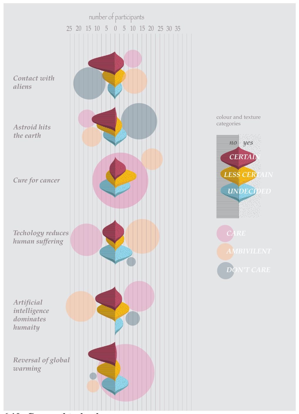
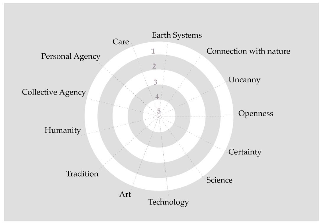
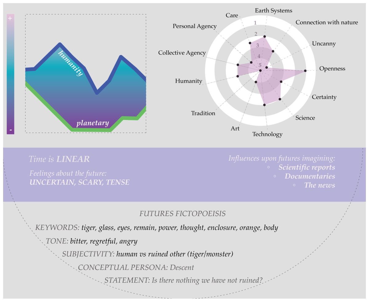
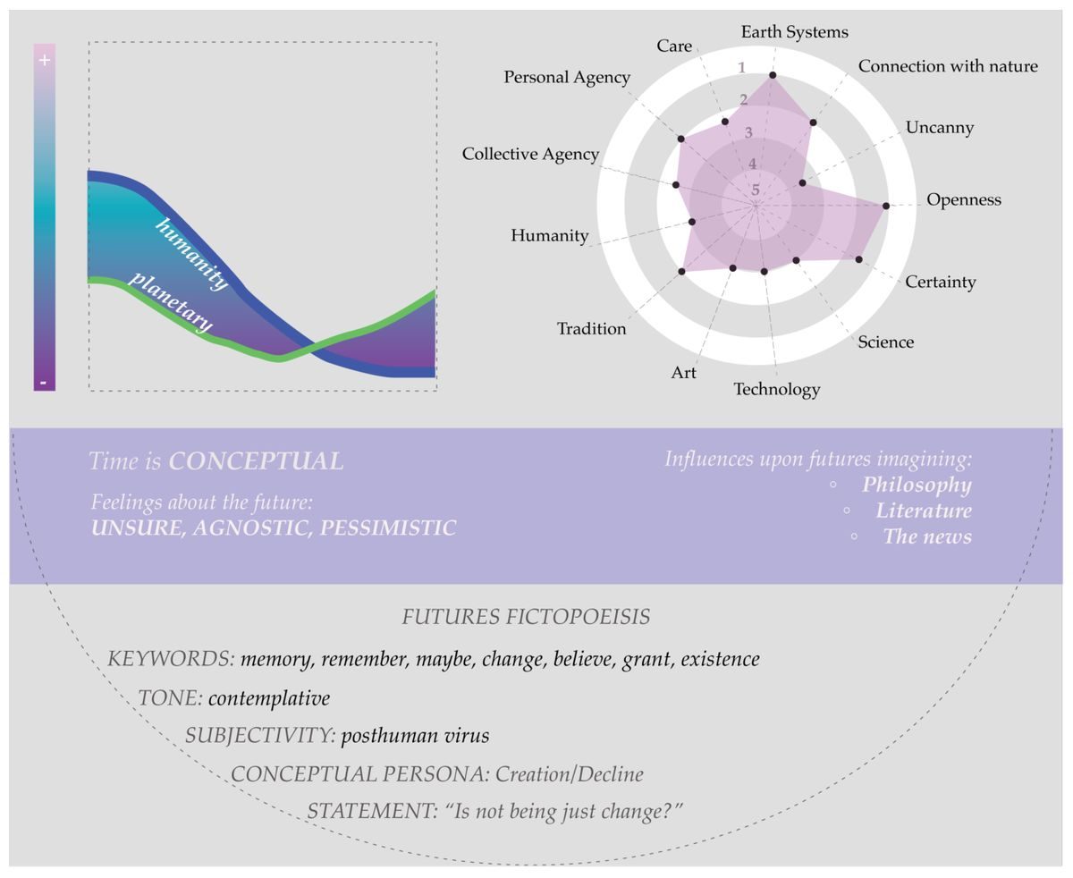
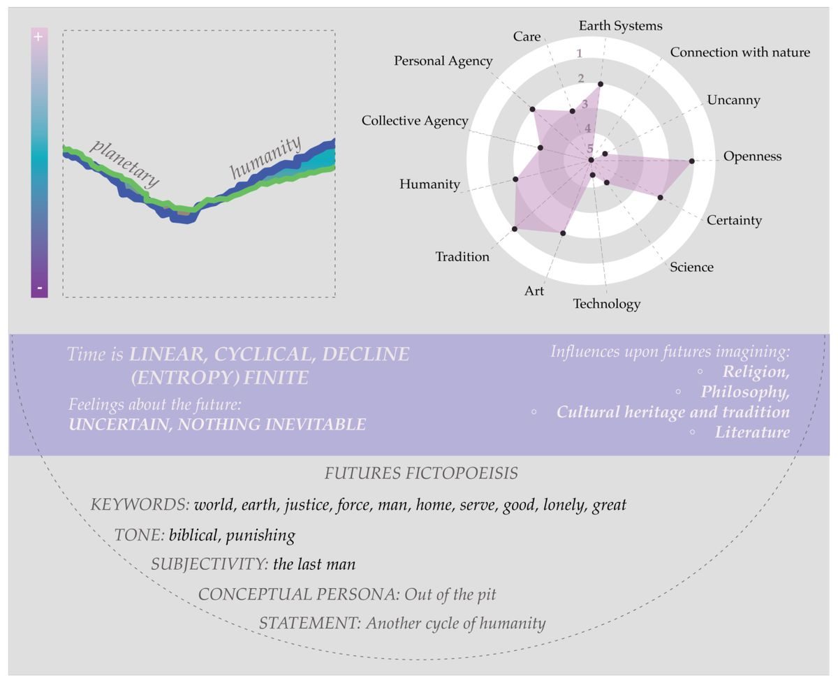
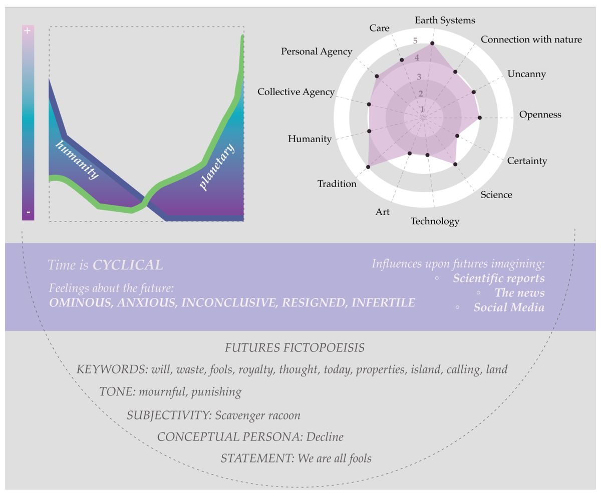
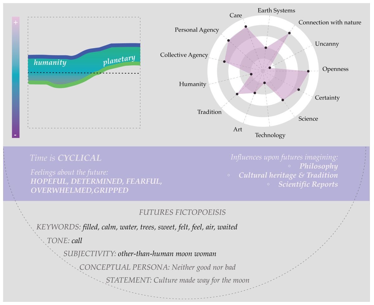
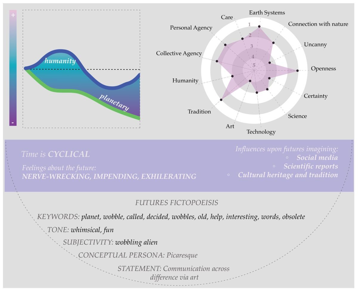
Visualizations from my doctoral thesis, Writing the futures imaginary — the whole set, in the order the study unfolds. It opens with the dissertation drawn as a machinic assemblage and a concept map of futures literacies, moves through the instruments (an archetype prompt, a deck of futures tarot cards, the blank grid handed to each participant), and ends with a portrait of every participant’s futures literacies as a radial graph paired with their own plotline.
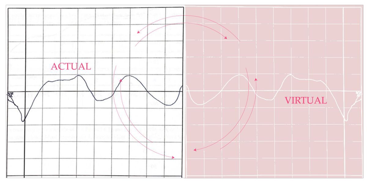
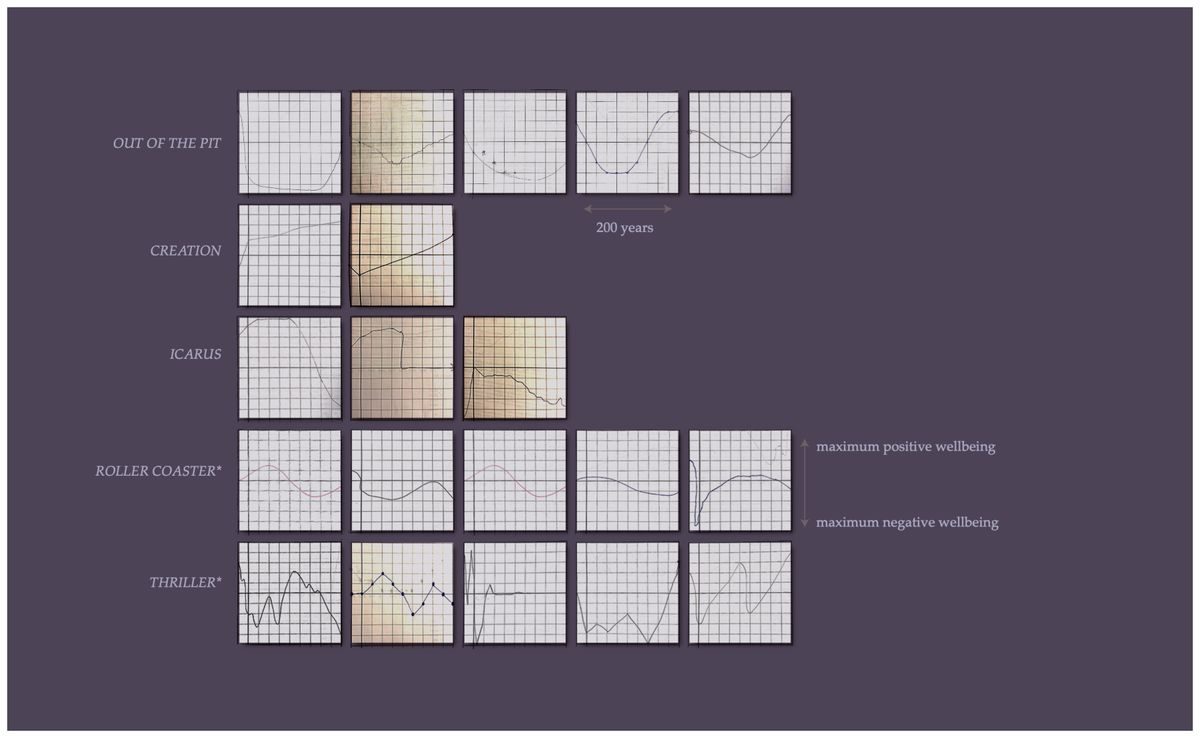
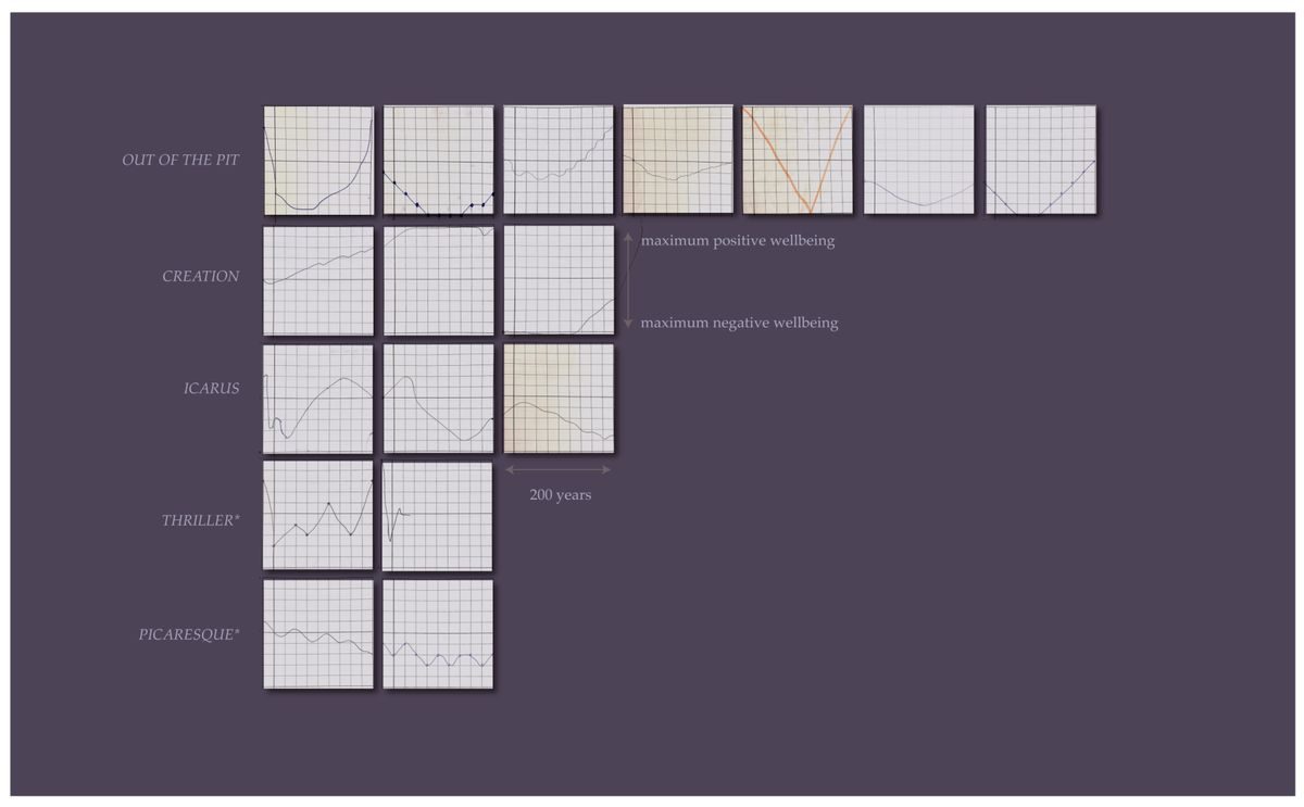
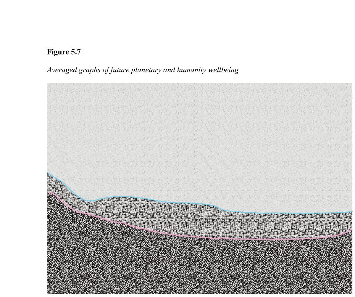
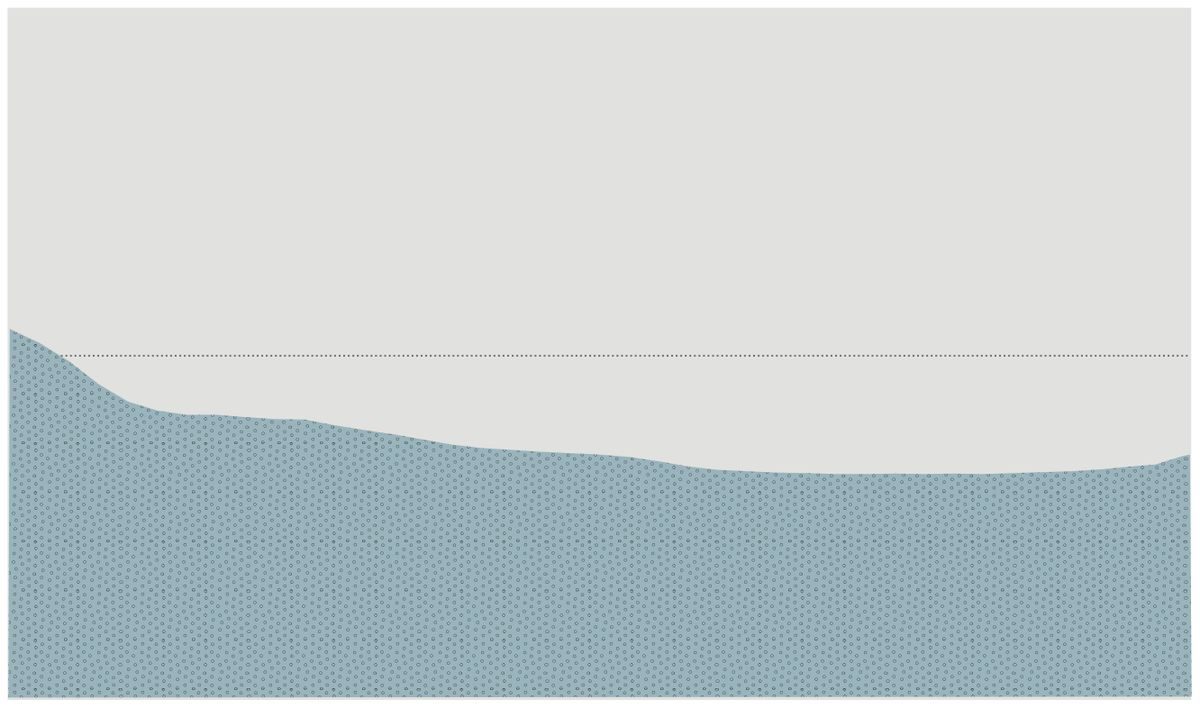
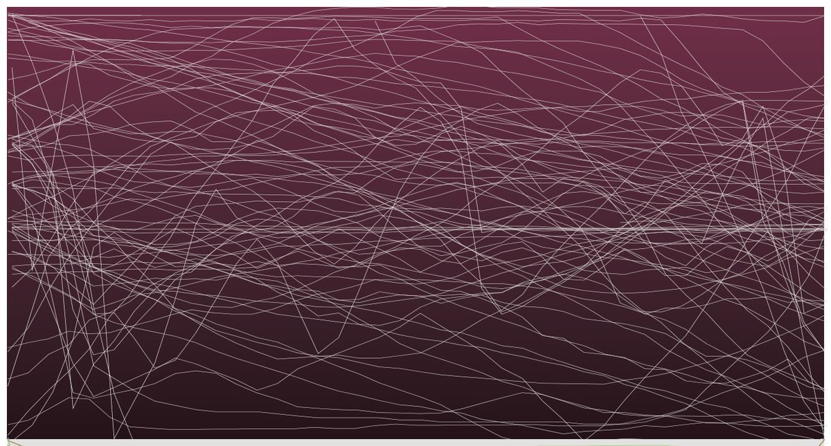
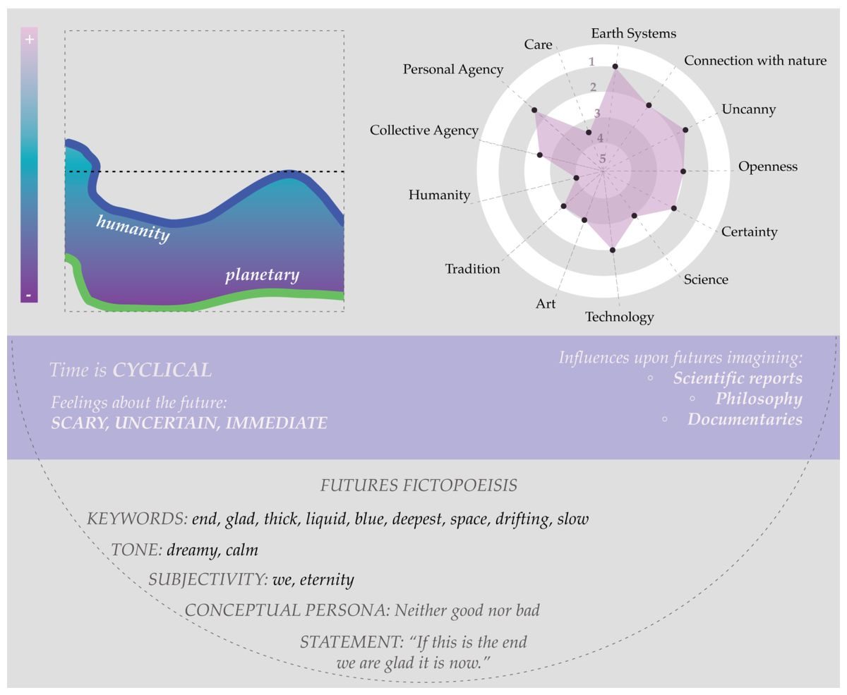
At the centre are the wellbeing renderings. Participants were asked to draw a line: the total wellbeing of humanity across two hundred years, from maximum positive to maximum negative, and then the same for the planet. Sorting the drawn lines produced narrative shapes rather than data classes — picaresque, descent, Kafkaesque descent, neither good nor bad. To make the renderings I had to touch every line: photograph each graph, trace it in WebPlotDigitizer with as many clicks as the hand-drawn nuance demanded, rebuild it in Excel, then take it into Illustrator for texture, colour and shape.
The averaged graph reads blue for human wellbeing, pink for planetary, with a dotted centre line at neutral. Both trace what I read as an Out of the pit narrative, yearning toward a horizontality well below neutral, with a faint persistent uptick at the very end — the remnant, the hope, the belief that things might turn out.
Click any rendering to see it full size.